12/06/2026
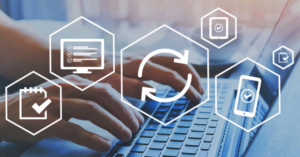
This year's Global Wellness Day is a reminder that wellness isn't just a buzzword in HR decks. It's about the practical stuff: how we work and whether we have the space, support, and flexibility to show up as ourselves.
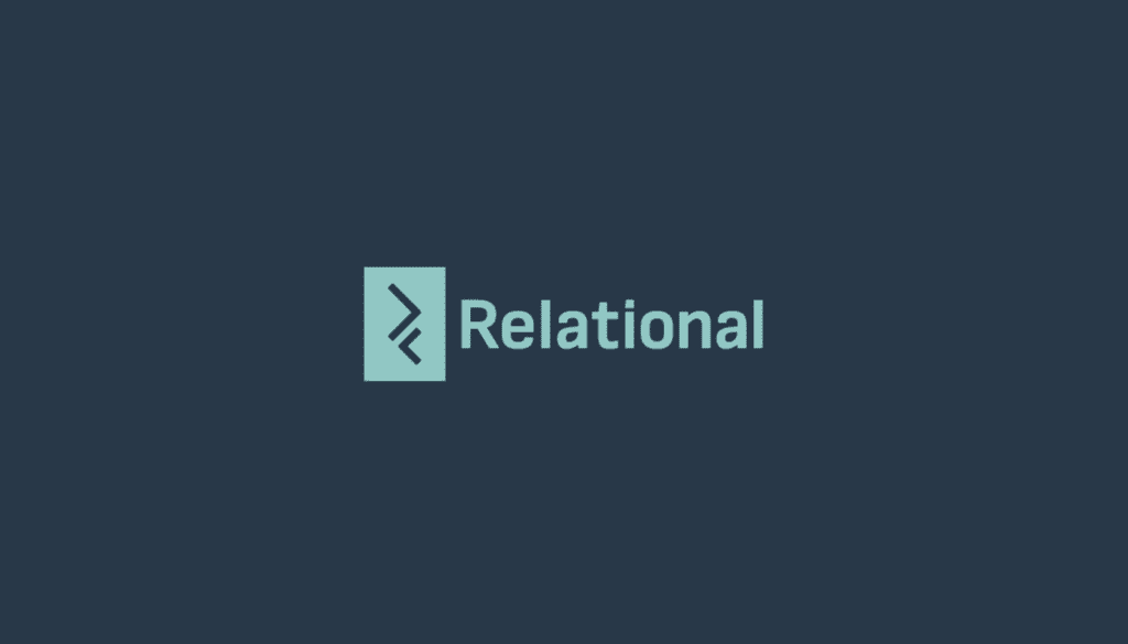
Pioneering since 1995 in business software solutions, we’re thrilled to unveil the next chapter of our journey with a brand new look and feel.
At Relational , we’ve always been at the forefront of technology. Today, we’re excited to announce our new brand identity, reflecting our commitment to our customers and our drive for excellence.
The colour combination of our logo carries the past and the future of Relational. More specifically,
Blue is the constant. Carries our company’s history and gravitas
Mint is the freshness. Carries our company’s mindset for constant innovation and evolution.
Finally, the logo icon is inspired by coding. Relational exist within coding tags but also moves above and beyond. This is how we cherish our history and move forward.
Join us as we step into the future and stay tuned for more 😊🚀